Yuanyuan Wang


Achieved an 83% improvement in data processing efficiency by visualizing core sales dataI.
B2B
UI Design
Dashboard
DATA
VISUALIZATION
DESIGN

Project
overview.
TuBao developed an integrated platform to automate its sales website's order processes, boosting work efficiency.
TuBao's sales website handles order-related processes manually (including shipping, warehousing, and sales data accounting), leading to inefficiency and increased management costs. To address these challenges, the company developed an integrated backend management platform to automate operations.
Role
UX/UI Designer
Team
1 Product Manager
2 UX/UI Designer
2 Developer
Timeline
4 Month
(Shipped)
Project
problem.
Manual data accounting by staff causes inefficiency and errors.
The current backend system lacks data visualization tools. Staff must switch between multiple data sources and spend excessive time manually calculating core data, leading to inefficiency and delayed decision-making.
Time-consuming
Error-prone
Inefficient
Project Objectives
-
Reduce manual calculation time and data errors to improve work efficiency.
-
Provide real-time data analysis to support faster decision-making.
Solutions
Visualizing core sales data cut manual calculation time and errors, boosting work efficiency
By organizing and visualizing core sales data, we reduced manual calculation time and errors, thereby improving work efficiency.
-01.png)
Light Mode

Dark Mode
Impact
83%
Reduced core sales data processing time from 6 hours to 1 hour.
Data Processing Efficiency
100%
All users reported that the data visualization tool significantly aids their business decisions.
Positive Feedback
Design
Process.
Target User & User Needs
To understand the core functional needs for data visualization, I conducted interviews with key personnel from sales, warehouse, finance, purchasing, and supply departments.
During these interviews, all users expressed a desire for data visualization.
However, each department had different needs regarding which data they needed visualized.
Sales Dept
Warehouse Dept
Purchasing Dept
Supply Dept
Finance Dept
Core data organization and analysis
Through the research, I discovered that all departments prioritize six key metrics:
orders, revenue, visits, total products, top categories, and top products.

Orders
Total Products
Revenue
Top Categories
Visits
Top Products
Design Challenge
How might we design data visualization tools that cater to the specific needs of each department?
Design
Process.
Based on work experience, I utilized our design system to quickly design a solution.


Display 'total order', 'total revenue', 'total products', and 'total visits' using numbers
For data such as 'order', 'revenue', 'total products', and 'visits', users require real-time figure. Displaying the numbers can effectively communicate crucial details.

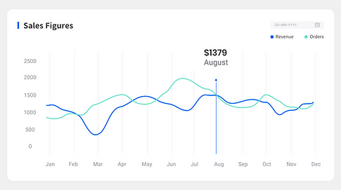
Display 'order', 'revenue' using line graph
Users routinely check and compare 'order' and 'revenue' data for decision-making. I proposed a line graph to show their temporal trends, with y-axis values based on historical data and months marked on the x-axis, enabling swift decisions.
Display 'top categories' using doughnut chart
I considered between bar, pie and doughnutcharts for displaying top categories.
Despite the industry's general aversion to pie charts, they are ideal here to show
the percentage contribution of each of the four categories to the total.
As a similar visualization to pie charts, doughnut charts offer better visual clarity than pie charts. So, I‘d chosen a doughnut chart for its clear depiction of part-to-whole relationships.


I sorted in descending order starting with the largest category-Floor. This took into account our natural construct of reading around a circle.

Display 'top products' using bar chart
I chose bar charts for top products to easily identify sales leaders. I tested both vertical and horizontal bar charts, setting y-axis values from historical data.


Initially, I favored horizontal bar charts for their readability.
However, due to audience familiarity and better suitability for screens, I ultimately chose vertical bar charts.

After completing the preliminary design, I discussed it with the PM, he pointed out that for the four data of total order, total revenue, total products and total visits, users currently need to spend some time reading to identify the specific metrics.
Based on this feedback, I proposed two design iterations.
Iteration 1
Enlarge the font size of the data


Iteration 2
Add icons related to the data
✅
After further discussion with the project manager, we agreed that icons are more intuitive. Icons enable users to quickly identify the content represented by each data, so we chose it as our solution.
But when I presented this solution to gather user feedback, one of them posed a concern.

For the data-orders, total revenue, total products, and total visits-users not only need to know the real-time data but also need to compare it with data from the previous day. So, the current design still requires them to manually perform these comparisons.
Before
After
-01.png)
Based on this feedback, I made another iteration. I added compa-rison values beneath the real-time data to show the differences
from the previous day.
Enhancing Usability by Adding Dark Mode to Accommodate Diverse User Needs
After completing the design, I realized I had overlooked specific scenarios and users. Users who spend extended periods on the computer in light mode can experience eye fatigue. Moreover, for those with light sensitivity or visual impairments, light mode offers less accessibility compared to dark mode.
Therefore, I added dark mode, aiming to accommodate various users and scenarios, thereby enhancing the product's usability.
Light Mode
Dark Mode
Testing
Result.
After completing the prototype, we invited 10 users (2 from each department) for usability testing. The main objectives were to:
-
Assess if the visualization design significantly reduces the time users spend on manual calculations.
-
Measure the change in overall work efficiency with the data visualization tool.
-
Test the ability of users to perform real-time data analysis using the data visualization tool.
"
I'm unable to identify the specific product from the bar chart.
"
Improving Product Insights by Enhancing Bar Charts with Detailed Product Lists
Users noted that the bar chart's information on top products was limited and lacked detailed product identification. In response, I converted the bar chart into a more detailed product list format that includes product images, click counts, and sales volumes. This enhancement provides a clearer understanding of each product.


Before
After
Success
Metrics.
83%
Reduced core sales data processing time from 6 hours to 1 hour.
Data Processing Efficiency
100%
All users reported that the data visualization tool significantly aids their business decisions.
Positive Feedback
What’ve
I learned?
Optimize workflows to enhance work efficiency
B2B products involve various roles. the design Focus should be placed on optimizing workflows, reducing operation steps, and enhancing work efficiency during the design process.
Display complex information concisely
B2B users prioritize functionality and efficiency. The design must consider how to clearly present complex information on the interface, ensuring users can quickly find the necessary functions.
END
Thanks.
More projects...

Simply accessibility and design features for online worship, boosting user flow efficiency by 62%.
Simply accessibility and design features for online worship, boosting user flow efficiency by 62%.

Restructure the website's information architecture and content, resulting in a 37% increase in average session duration.
Restructure the website's information architecture and content, resulting in a 37% increase in average session duration.